
Saturday, May 27, 2006
Look, Ma, I Fixed It!
Y'all are gonna love this. All right, y'few are even gonna care, with only y'one or y'two loving it. Remember when I talked about the Red Sox 80s road uniform (worn from '38-'72, '79-'89), with the BOS/TON, which breiefly was BO/STON? (Meaning the BOS was to the left of the middle button-down line, and the TON to the right.) It was from this post, from December 2004. And also mentioned in November 2005 here. Back then, I wrote the following statement:
"So when you've got an even number of letters, unless you cut [the] third one in half, or leave a space on the overlap (easy when you've got a space to work with--'RED [space] SOX' on the home jerseys), the word can't be centered."
In other words, on a button-down shirt, the middle line is actually left of center, since there's the portion of the shirt where one half overlaps the other. With an odd number of letters in your word, you just put the fourth letter on the overlap--dead center--with three letters on each side, to center it. But the Red Sox obviously struggled with their six letters, and never having found a centering solution, they chose to go front-heavy, with the T in the center, or back-heavy (in '85 and '86)(edit: it started in '84, actually), with the S in the center.
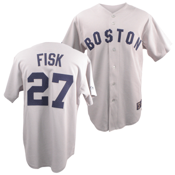
Well, a few weeks ago at Fenway, Pat spotted an old Sox road jersey, where the third letter, the S, was cut in half. In other words, the word Boston was perfectly centered on this retro-jersey. To the left, you'll see a picture of the jersey, a Cooperstown Collection one, from yawkeywaystore.com. That's right, people, they took my advice: they cut the third letter in half. Wow. A centered "BOSTON."
That said, come on. The incongruity made the jersey. That old road jersey was so bland, it was only fitting that they just couldn't figure out--in fifty years--how to center the word "Boston" on it. And that's why we loved it so. So, the Cooperstown Collection people went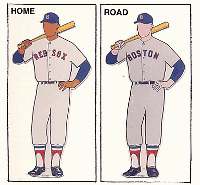 off the board on that decision, but even worse, they put the name on the back. Those road grays (left, from Dressed To The Nines, '71 model pictured) never had the player name. In fact, selling a Fisk one doesn't work with me either, since he rarely wore that style. During most of his Red Sox career, he wore the pullover with the red letters and the red and black stripes.
So, Cooperstown Collection, you're welcome. However, I tricked you, since when we nerds want retro, we want exact. I hate to tell you this, but you folks just took the crack out of the Liberty Bell. You straightened the Tower of Pisa. Terrible job.
In tonight's game, the Sox won. Schilling's 200th should take Jeter's 2000th right out of the national headlines. I realized tonight that I saw Curt's 199th win and Pedro's 200th within a few weeks. Cool. Youk played well in left tonight. "Job, Terrible" Snow played first. Will he be around long? Eh...Snow, Peg. Loretta's on fi-ya. Still two games up. I'll be in Toronto on Tuesday night. Hopefully I'll get some blogging in before then.
"So when you've got an even number of letters, unless you cut [the] third one in half, or leave a space on the overlap (easy when you've got a space to work with--'RED [space] SOX' on the home jerseys), the word can't be centered."
In other words, on a button-down shirt, the middle line is actually left of center, since there's the portion of the shirt where one half overlaps the other. With an odd number of letters in your word, you just put the fourth letter on the overlap--dead center--with three letters on each side, to center it. But the Red Sox obviously struggled with their six letters, and never having found a centering solution, they chose to go front-heavy, with the T in the center, or back-heavy (in '85
 and '86)(edit: it started in '84, actually), with the S in the center.
Well, a few weeks ago at Fenway, Pat spotted an old Sox road jersey, where the third letter, the S, was cut in half. In other words, the word Boston was perfectly centered on this retro-jersey. To the left, you'll see a picture of the jersey, a Cooperstown Collection one, from yawkeywaystore.com. That's right, people, they took my advice: they cut the third letter in half. Wow. A centered "BOSTON."
That said, come on. The incongruity made the jersey. That old road jersey was so bland, it was only fitting that they just couldn't figure out--in fifty years--how to center the word "Boston" on it. And that's why we loved it so. So, the Cooperstown Collection people went
 off the board on that decision, but even worse, they put the name on the back. Those road grays (left, from Dressed To The Nines, '71 model pictured) never had the player name. In fact, selling a Fisk one doesn't work with me either, since he rarely wore that style. During most of his Red Sox career, he wore the pullover with the red letters and the red and black stripes.
So, Cooperstown Collection, you're welcome. However, I tricked you, since when we nerds want retro, we want exact. I hate to tell you this, but you folks just took the crack out of the Liberty Bell. You straightened the Tower of Pisa. Terrible job.
In tonight's game, the Sox won. Schilling's 200th should take Jeter's 2000th right out of the national headlines. I realized tonight that I saw Curt's 199th win and Pedro's 200th within a few weeks. Cool. Youk played well in left tonight. "Job, Terrible" Snow played first. Will he be around long? Eh...Snow, Peg. Loretta's on fi-ya. Still two games up. I'll be in Toronto on Tuesday night. Hopefully I'll get some blogging in before then.
Comments:
<< Home
Unlike Jeter's "Tool" of a "Hit", The Real American Hero, Curt Schilling, has something tangible to remember in Victory #200.
Meanwhile, "The 5 Tool Tool" slapped 2 homers off KC "Pitching."
What is it that Sports-Scribes have to elect AFyankee as MVP?
Meanwhile, "The 5 Tool Tool" slapped 2 homers off KC "Pitching."
What is it that Sports-Scribes have to elect AFyankee as MVP?

One of my great regrets in life was not posting in this thread right away. I love this kind of stuff. I agree wholeheartedly about not having the names on the backs of these replica jerseys...one of my friends got a Fred Lynn throwback replica, and I don't like how it looks with "Lynn" on the back. I do, however, own a Sox t-shirt with "Williams 9" on the back, but I think tees are a little different.
I was a big fan of the old navy block-letter road jerseys. Part of me would actually like to see the Sox go back to them again, but unfortunately being forced to watch the Buckner play roughly 100,000 times over the years by Fox Sports has also given those unis a bit of a negative image. I think I could get over it though...
I was a big fan of the old navy block-letter road jerseys. Part of me would actually like to see the Sox go back to them again, but unfortunately being forced to watch the Buckner play roughly 100,000 times over the years by Fox Sports has also given those unis a bit of a negative image. I think I could get over it though...
great regrets, nice. I'd want the old back if it wasn't for the fact that they did such a nice job with these current ones.
<< Home
![]()


Post a Comment
If you're "anonymous," please leave a name, even if it's a fake one, for differentiation purposes.
If you're having trouble commenting, try signing in to whatever account you're using first, then come back here once you're signed in.